
Designing a user-friendly scheduled ordering feature for Starbucks’ mobile web app

Starbucks engaged our team to develop a scheduled ordering feature for their mobile web app, balancing customer convenience with internal operational constraints.
We delivered the final, fully annotated and validated designs to our client, together with a clickable prototype. This is an unreleased feature, under NDA. The project was completed October 2024.
In this project I was a mid-Experience designer, in a team of two. We worked end-to-end and split the work between the two of us. I did everything from competitor analysis to user journey mapping to wireframing and prototyping. We also did guerilla testing of our designs, for which I wrote the discussion guide and performed the interviews, notetaking and analysis.
This was a great project for my growth as a designer, as I had the opportunity to hone my communication skills and my way of respectfully challenging research decisions. In the end, despite having to follow a research approach that did not align with me, I felt that I had the opportunity to voice my opinion and open a conversation in the team which is a positive outcome in itself.
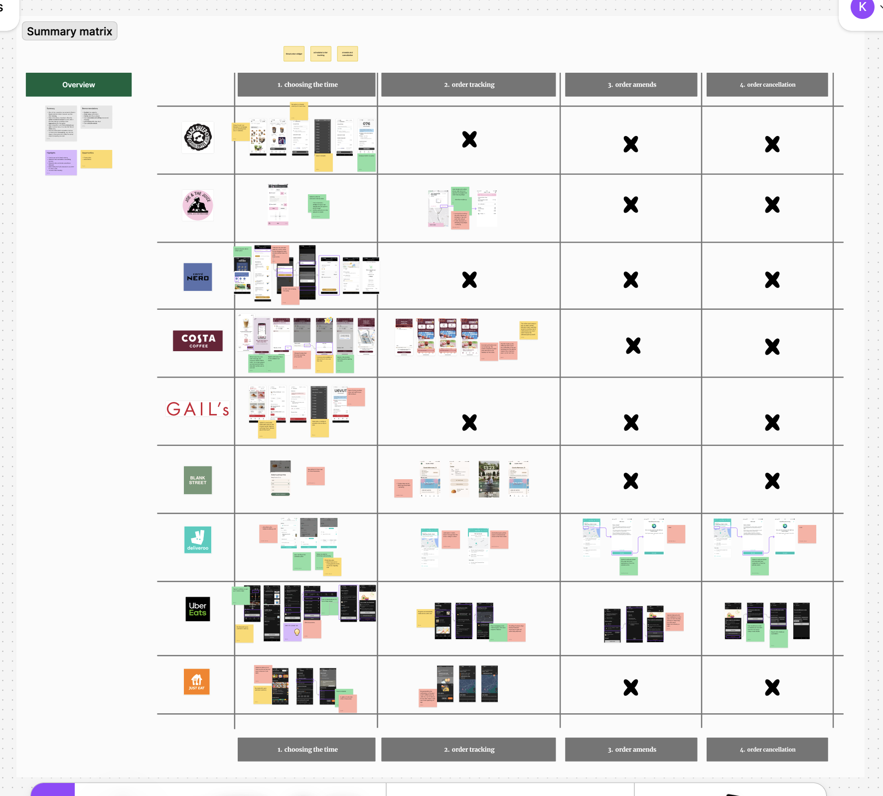
After the internal and external kick-offs, I analysed our competitors looking at various aspects of their scheduled ordering features, such as the ability to edit or cancel the order. To get a broader understanding and inspiration, I looked at both direct and indirect competitors, like coffee shop and food ordering apps.
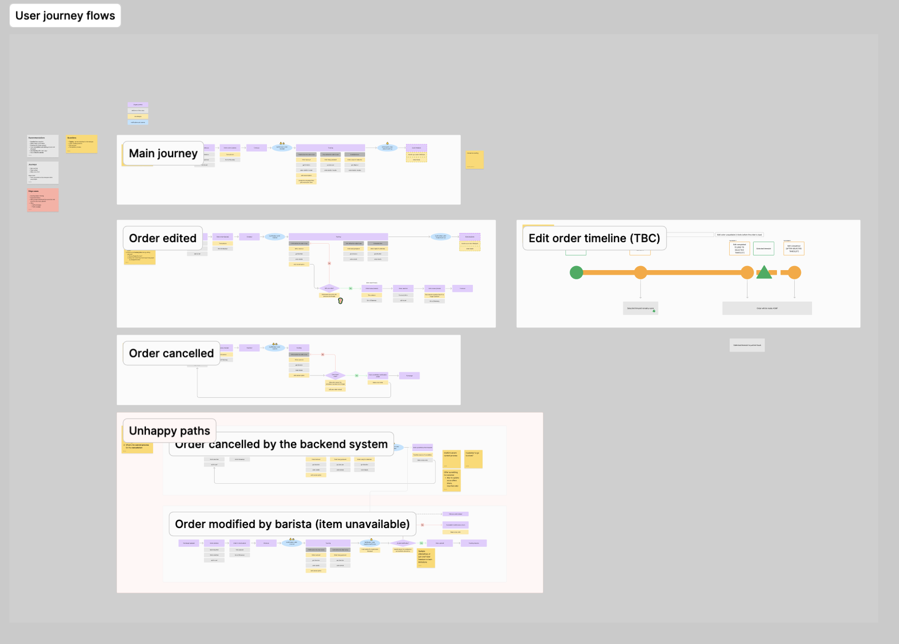
After identifying what worked and what didn't work so well for competitors, I mapped the key user journeys with my colleague.
I was responsible for mapping the cancellation flow, as well as two edge case scenarios. I also created a simple infographic to depict the timeline for the ability to edit the order at various stages after its placement. I shared this with my team and client to confirm that we had covered all the edge-cases of the order editing.
I then presented these user journeys to the Starbucks team and we discussed how we should approach certain scenarios based on the technical and operational capabilities of Starbucks.

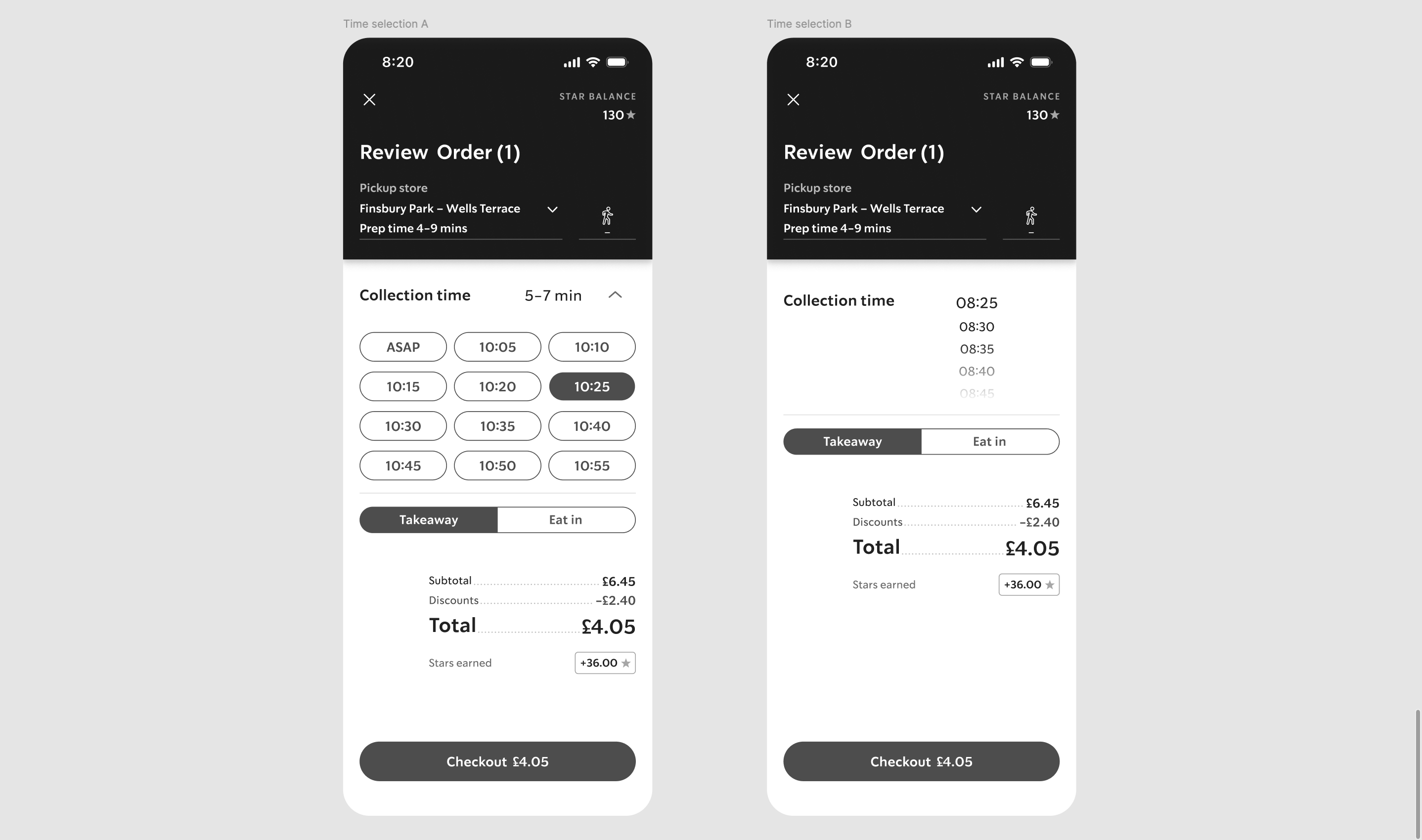
With the client sign off, I went off to sketch ideas for all the flows which I then reviewed with my colleague, and carried on creating the low- and mid-fidelity wireframes for a few of them. I shared the wireframes with the Starbucks team and after a few amends and the Starbucks team's agreement, I created the high-fidelity wireframes for the time slot selector, the cancellation flows and the edge-cases.
As a next step, we had planned to do Guerilla testing, showing the designs to participants in the form of a clickable prototype and asking them to complete some simple tasks and vote for their favourite design of the time slot selector, as we had designed two variations. We wanted to identify the main pain points and people's preferences.
Before the testing, having my UX researcher hat on, I tried to steer the team away from asking participants questions like 'Do you prefer [x] or [y] design?'. I believed that we, as designers, needed to make a decision on the best design solution and test purely the usability aspect with users. Alternatively, I suggested we did some form of Guerilla A/B testing and take a note of the design that users interacted better with, and move on with that.The rest of the team argued that since were happy with both time selection designs, we should open it up to the people to decide which one we should go with. I did not have much room for pushback, but at least had flagged the issues to the team and felt that we were making an informed decision.
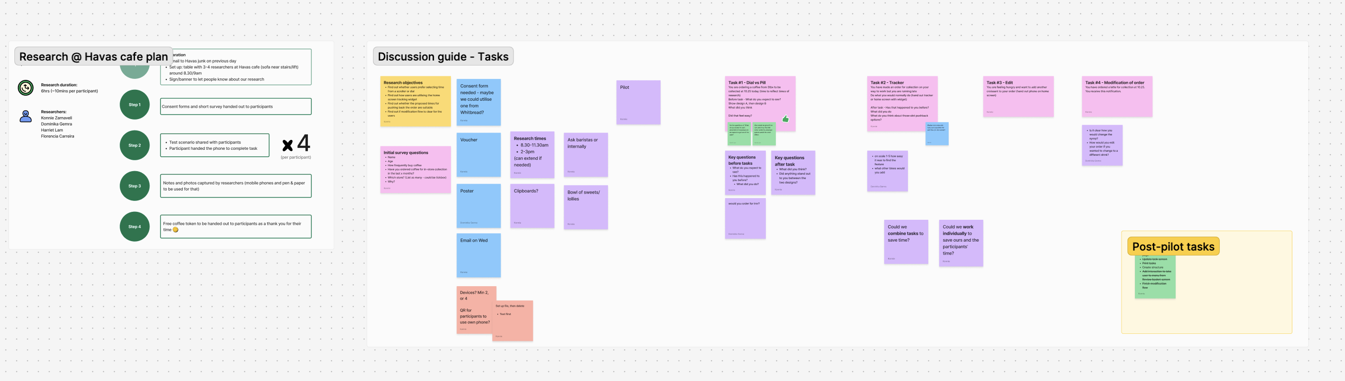
I crafted the tasks for our testing and liaised with our company's cafe to organise the guerilla research set up. We were aiming to speak to 40 people, split between 4 designers.

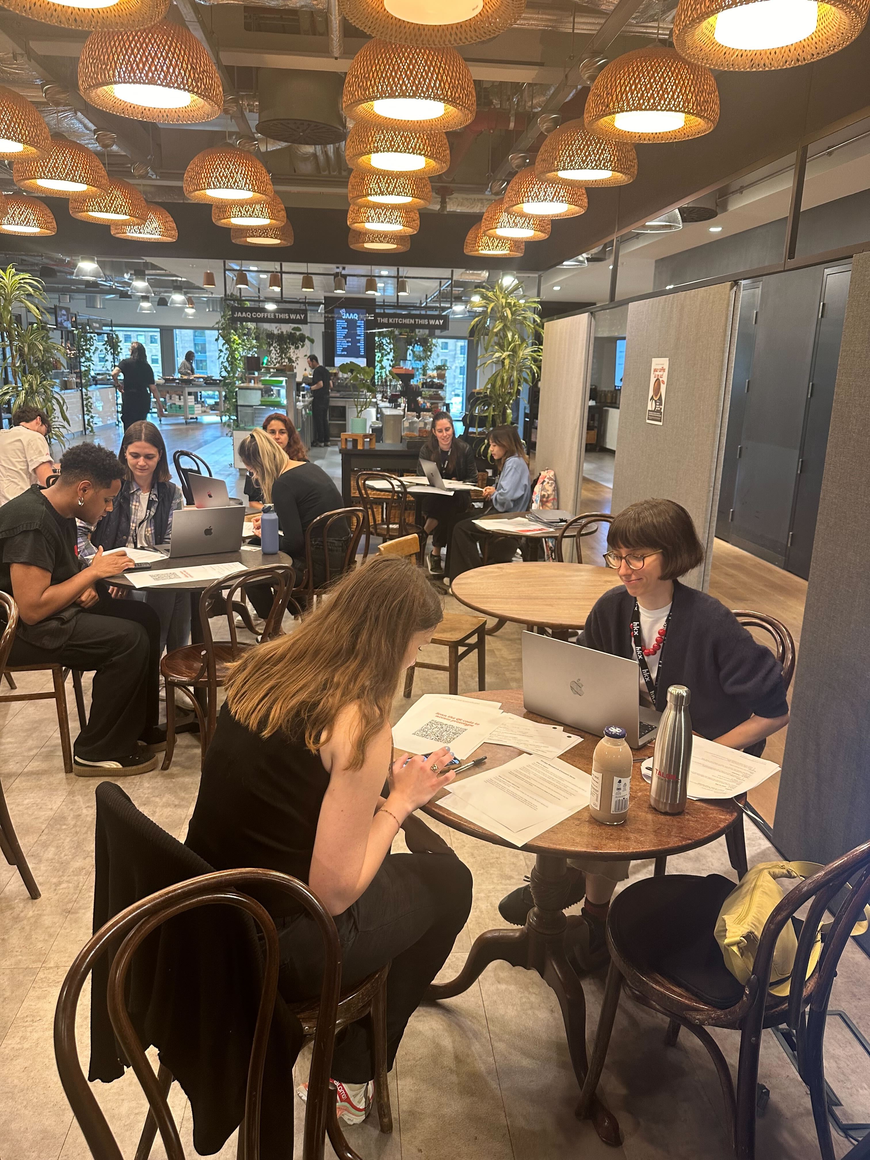
I facilitated 15 sessions during which I also did the notetaking. I then gathered all the notes and did thematic analysis with my colleague.
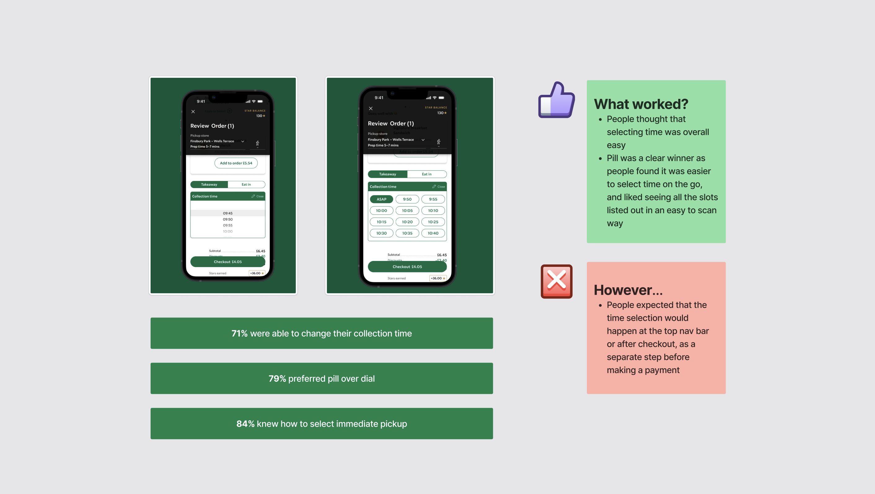
We identified the key user pain points and the time slot selector design that was the most popular. I presented the findings to the Starbucks team.
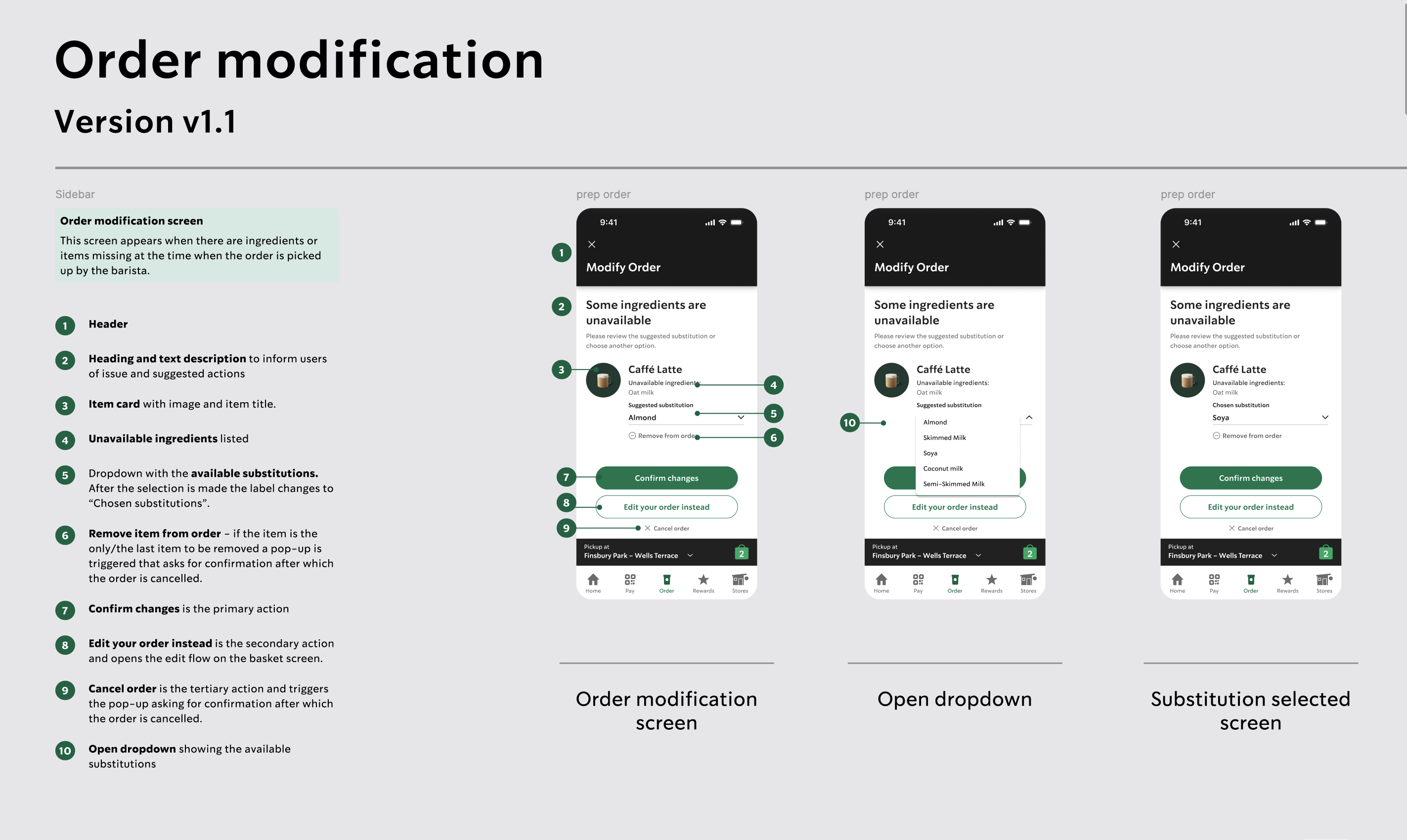
We then refined the designs based on the findings from the guerilla research and the Starbucks team feedback, creating the final designs. I was responsible for the full annotation of the final designs.
