
Streamlining navigation and footer information architecture for improved usability on the c2c train operator website
We were asked to redesign the navigation and footer as part of our retainer work for our client, train operator c2c.
Final designs for the main navigation and footer, and design QA. This project was completed early in 2023.
I was a junior Experience designer working alongside a Design director.
I did competitor analysis, ideas sketching, wireframing and prototyping for the main navigation and footer. I was also responsible for the new information architecture of the footer.
This was the first project in which I did UI work and design QA. It was really eye opening to see how important the latter is to ensure the designs are implemented in their intended way — especially when it comes to interactions. It helped me understand how to communicate better and best explain my requirements to developers.
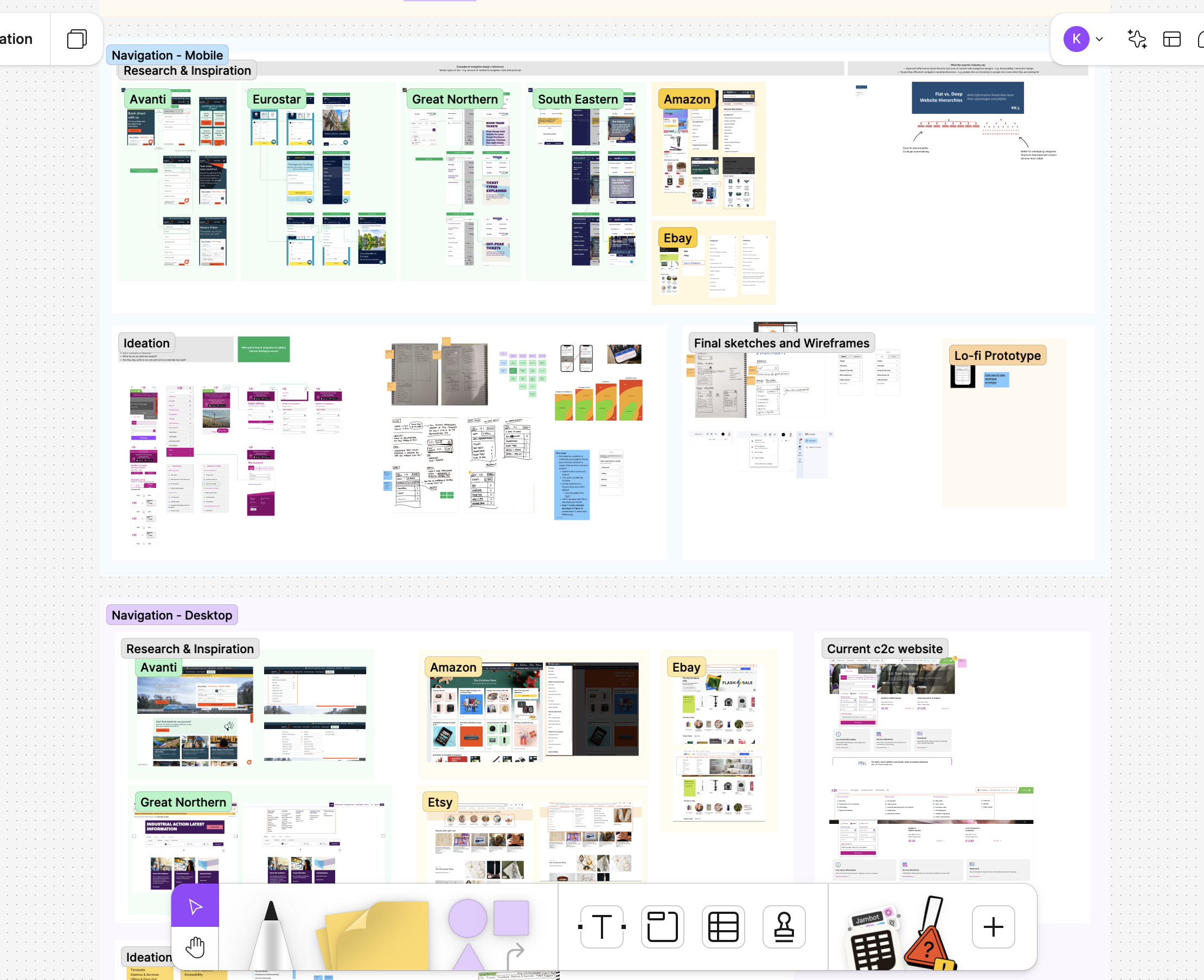
I did competitor analysis to the navigation of direct and indirect competitors, to understand what they were doing well and ways we could do things better. I also reviewed the current c2c navigation in depth, to understand its major issues. I realised that the c2c website had a flat information hierarchy with little structure, surfacing too many things at once. This might have made difficult and confusing for users to find what they were looking for, having a negative effect on conversion rates.
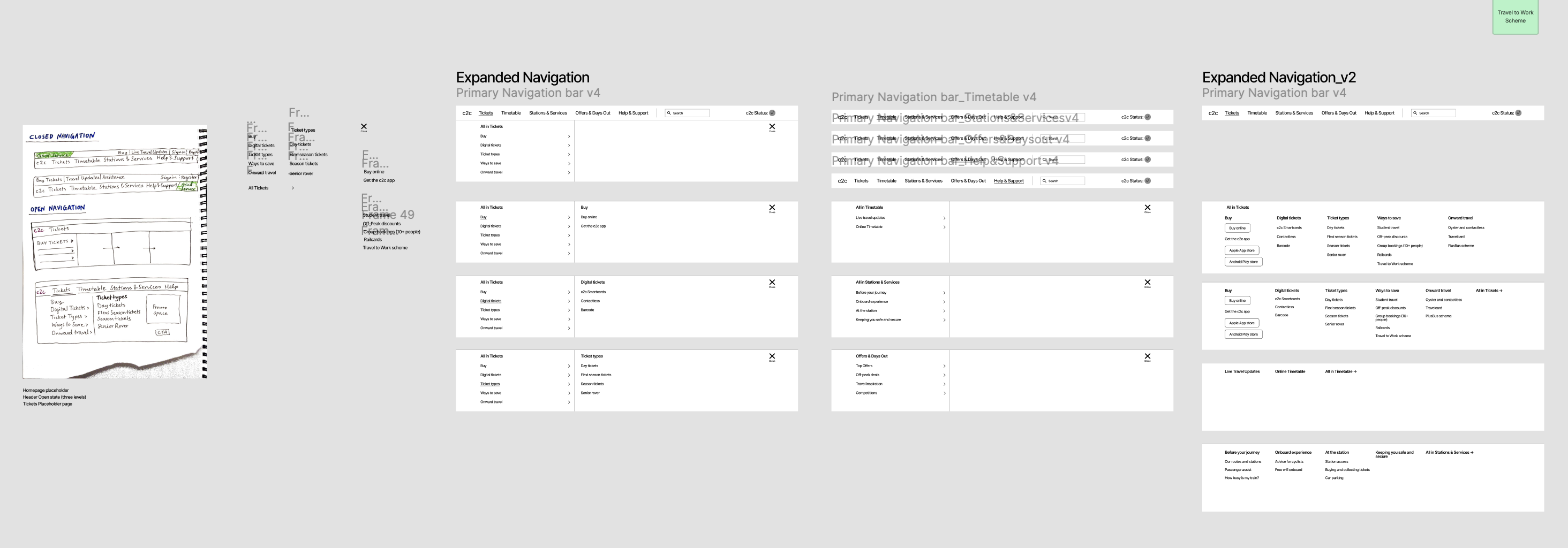
Equipped with insights from the competitor analysis and my review of the current navigation, I started sketching ideas. I experimented with various layouts as we wanted to offer our client options and allow them to decide what would work best, explaining the strengths and drawbacks of each solution. Some considerations that I needed to have in mind were ways to highlight promotions in the navigation, and the placement of the Service Status banner. After finishing the low-fidelity wireframing, my colleague took over to work on the more detailed wireframes and I focused on the footer of the page.
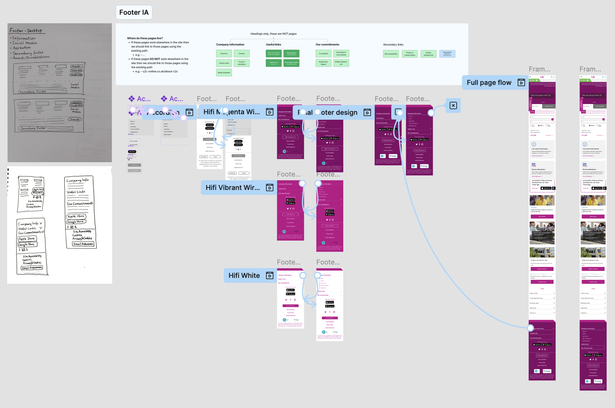
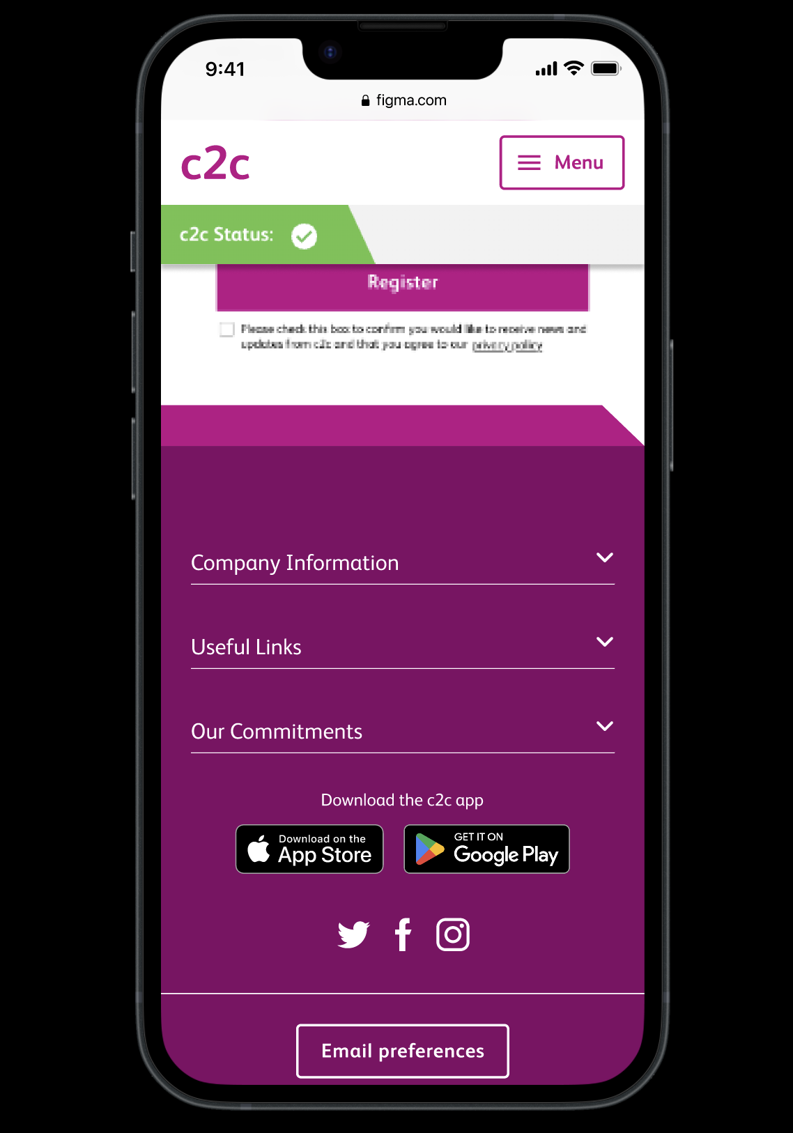
I analysed and grouped the relevant sections of the footer. I removed pages that were similar or repeated and provided a clear structure that would allow users to find the information they needed quickly and easily. With the c2c team happy with the new IA, I sketched ideas on how the footer should look. The c2c team also asked to add a banner for 'Safe spaces' and icons for the various payments they were able to take as well as social media links that were not in the footer before.
After a few rounds of iterations and discussions with developers, we had sign off and created the final designs and prototype.
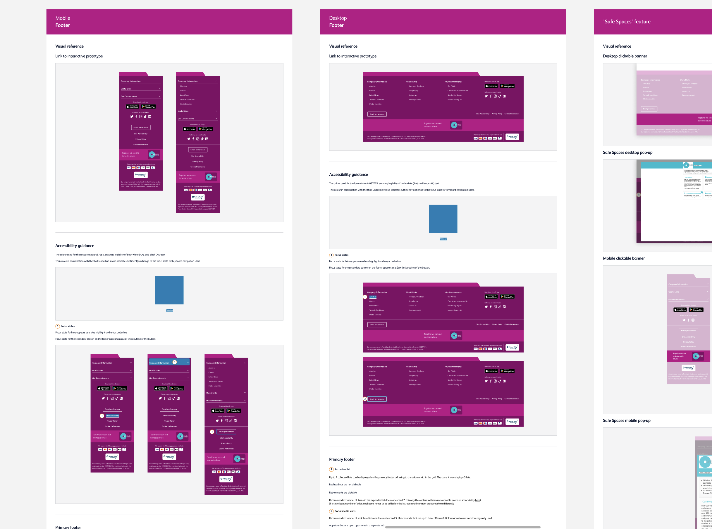
I prepared the designs for handover to developers. I annotated the footer navigation, including accessibility guidance and detailed specs for the developer team, checking with them in our weekly check-ins to make sure that everything was clear and working for them. After the initial implementation of the designs, I did multiple rounds of design QA for both the header and the footer, and made sure the implementation of designs was as intended.
The live designs can be seen on c2c-online.co.uk.
